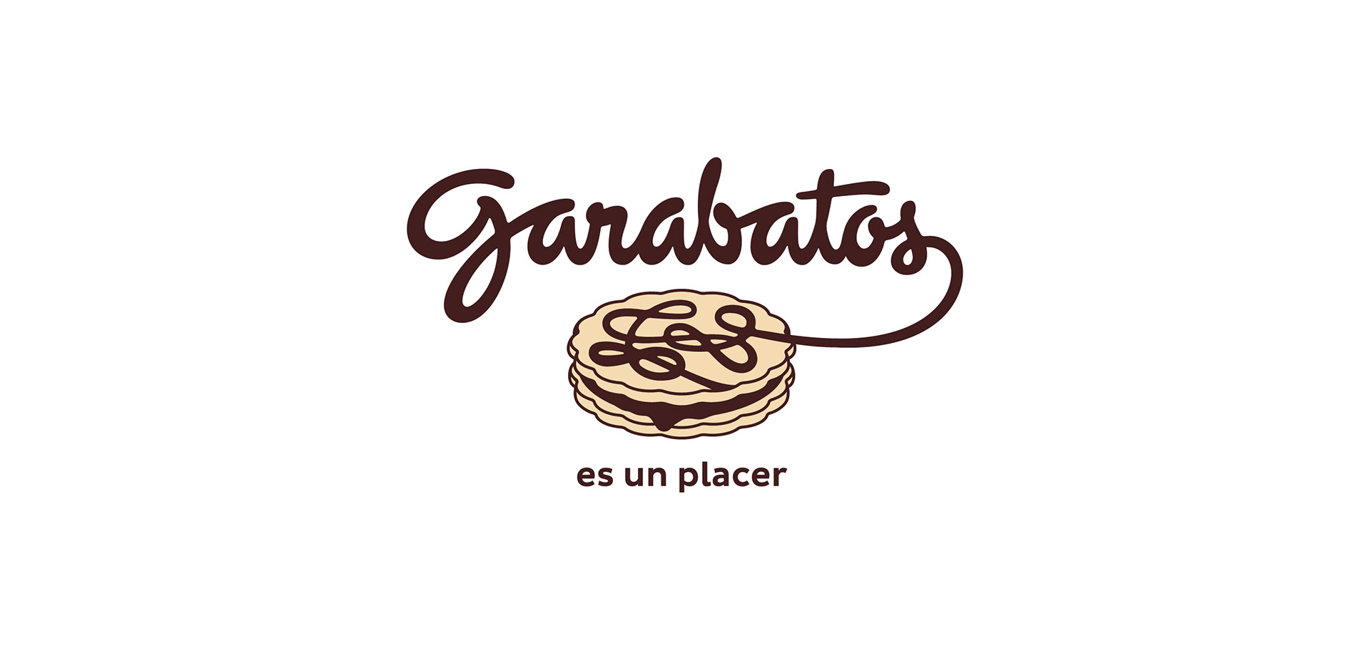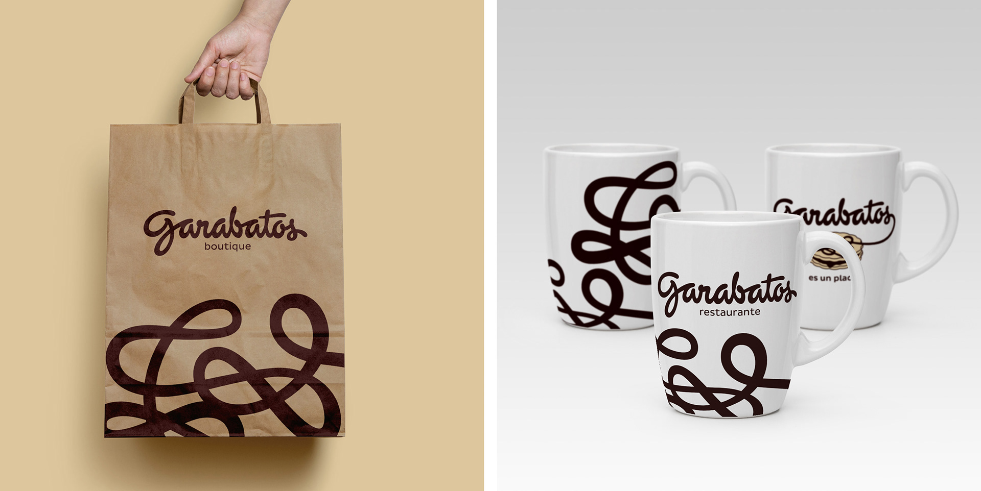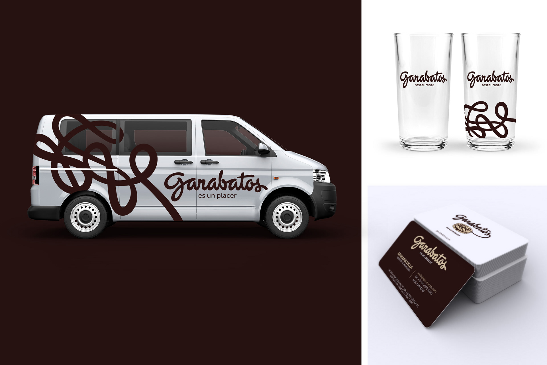
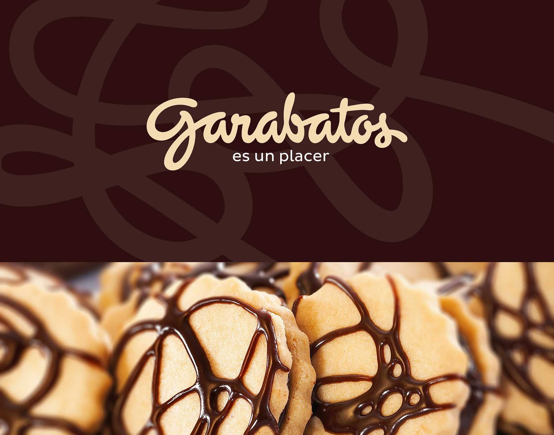
Garabatos is a group of restaurants and confectionery shops with more than 30 years in the market, offering products of the highest quality with an excellent service, in a comfortable environment.
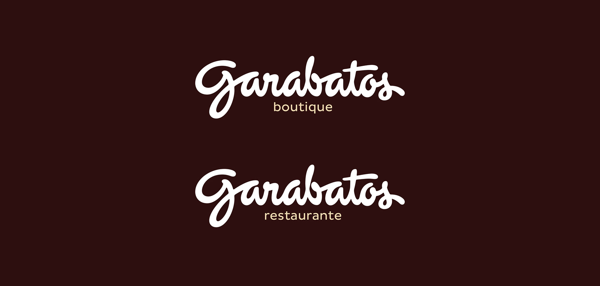
One of the problems it faces is the duality of the brand, as it is recognized by a certain people as a company focused on confectionery and by others as a group of restaurants.
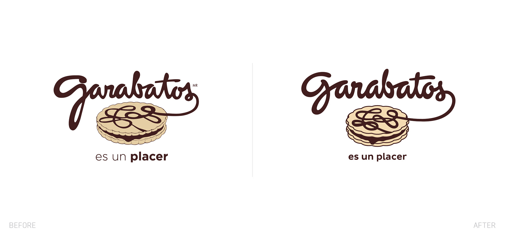
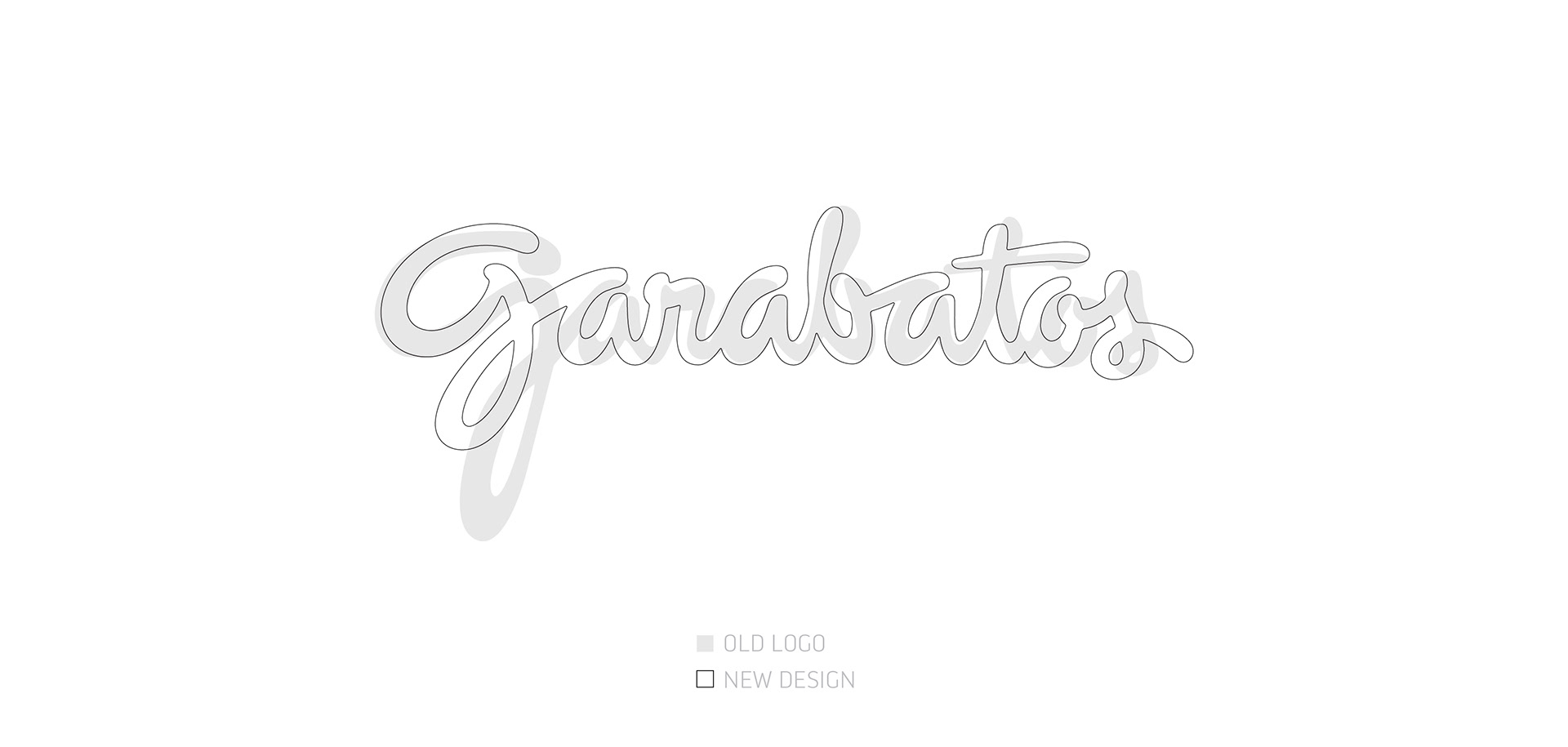
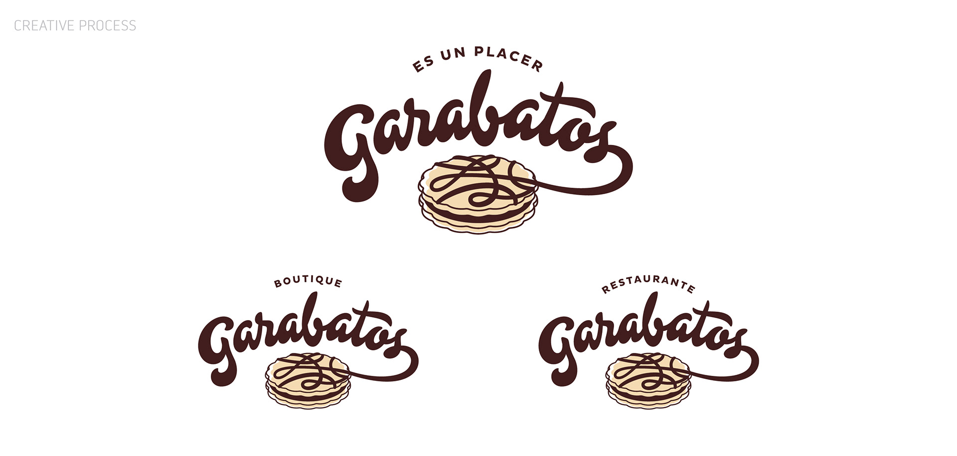
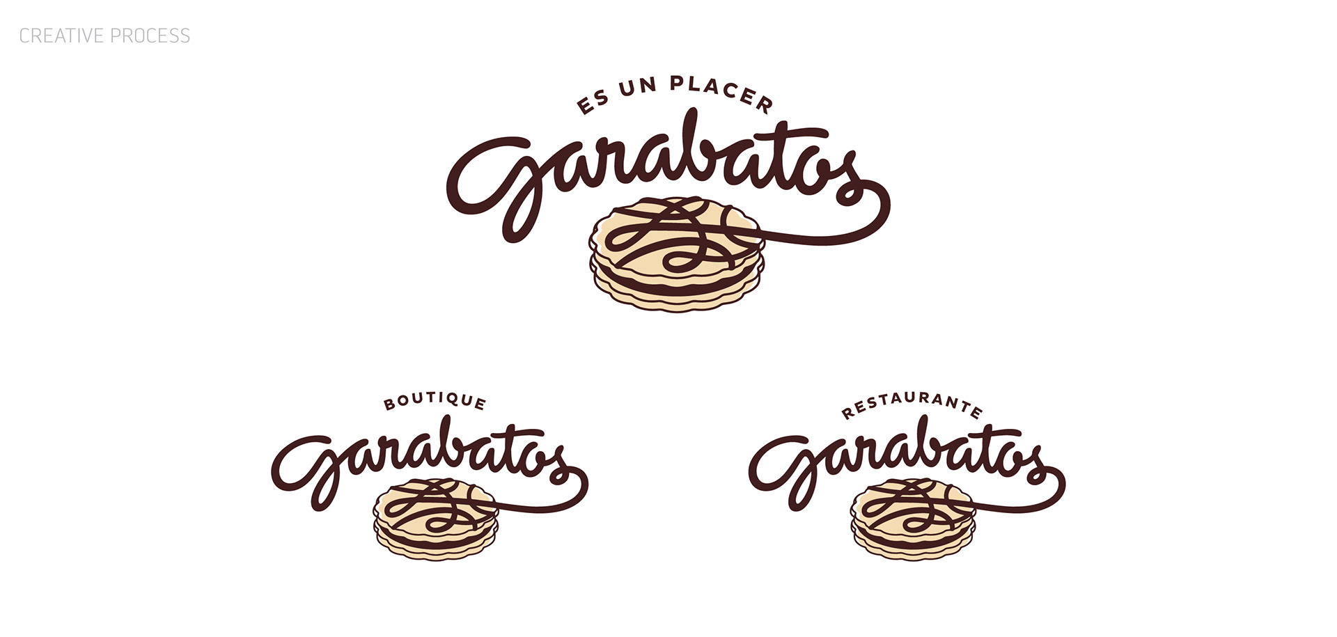
Garabatos contacted us to redesign their wordmark and suggested we did not touch the basic structure and coherence of the original logo. They wanted a facelift that was barely noticeable. In fact, the logo has had very few changes since the company was formed.
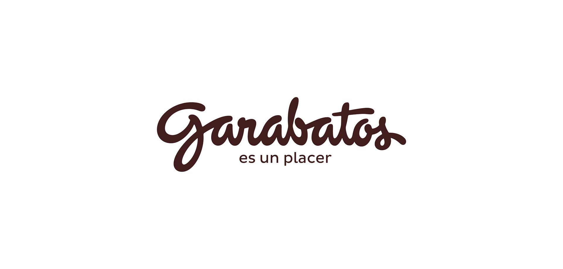
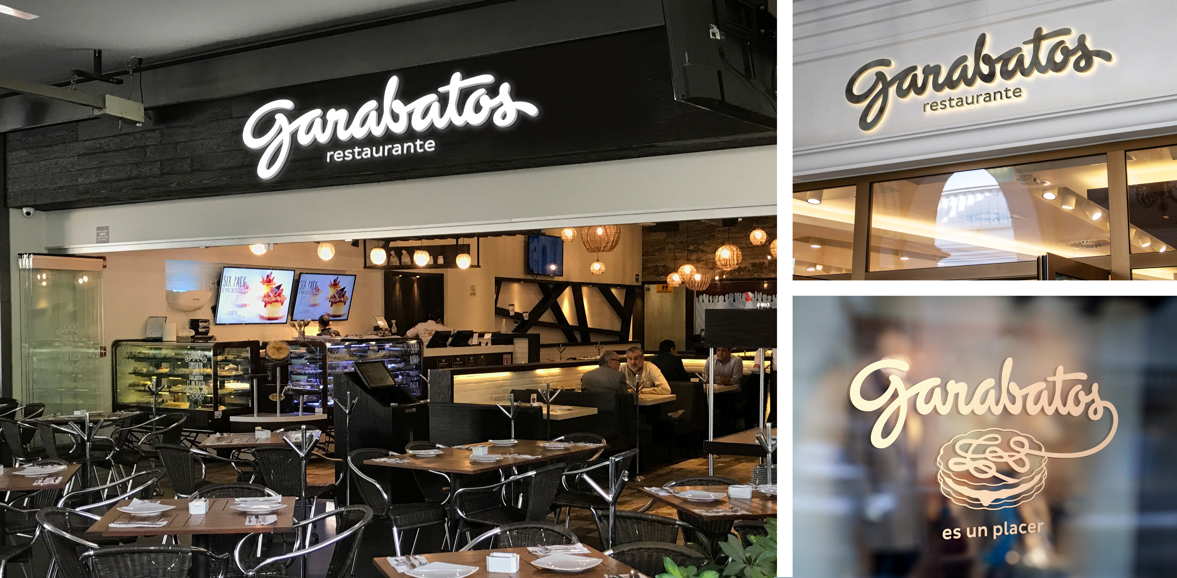
The primary concern and request were to be able to design a new letter “G" that allowed the client to compose the logo with a correct balance and proportion in its facade’s extreme horizontal formats. The hook in the original “G" descends way below the baseline and optimum horizontal area creating a size and weight imbalance. In some horizontal applications, the hook is cut and this was the first and most important thing we had to address.
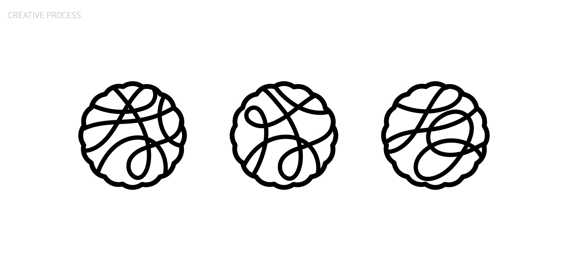
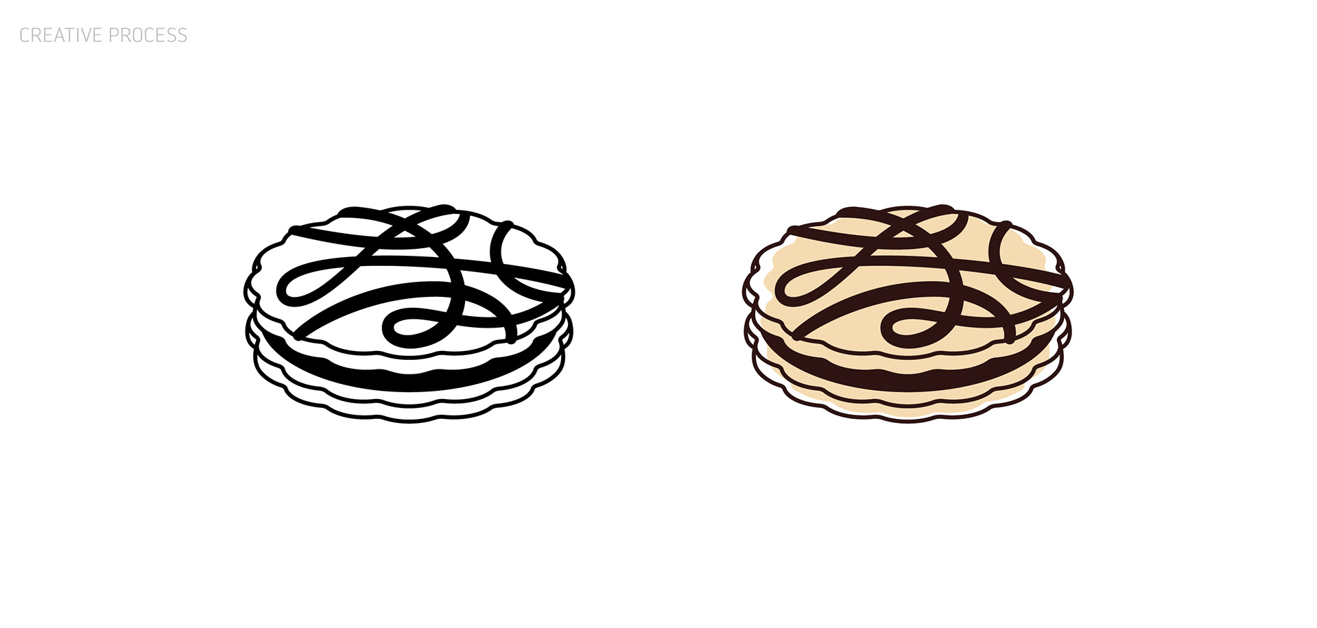
Based on the analysis of the graphic identity –logo + cookie symbol– we marked various aspects that were badly drawn and fixed them would benefit the overall appearance of the word mark without generating a drastic change.
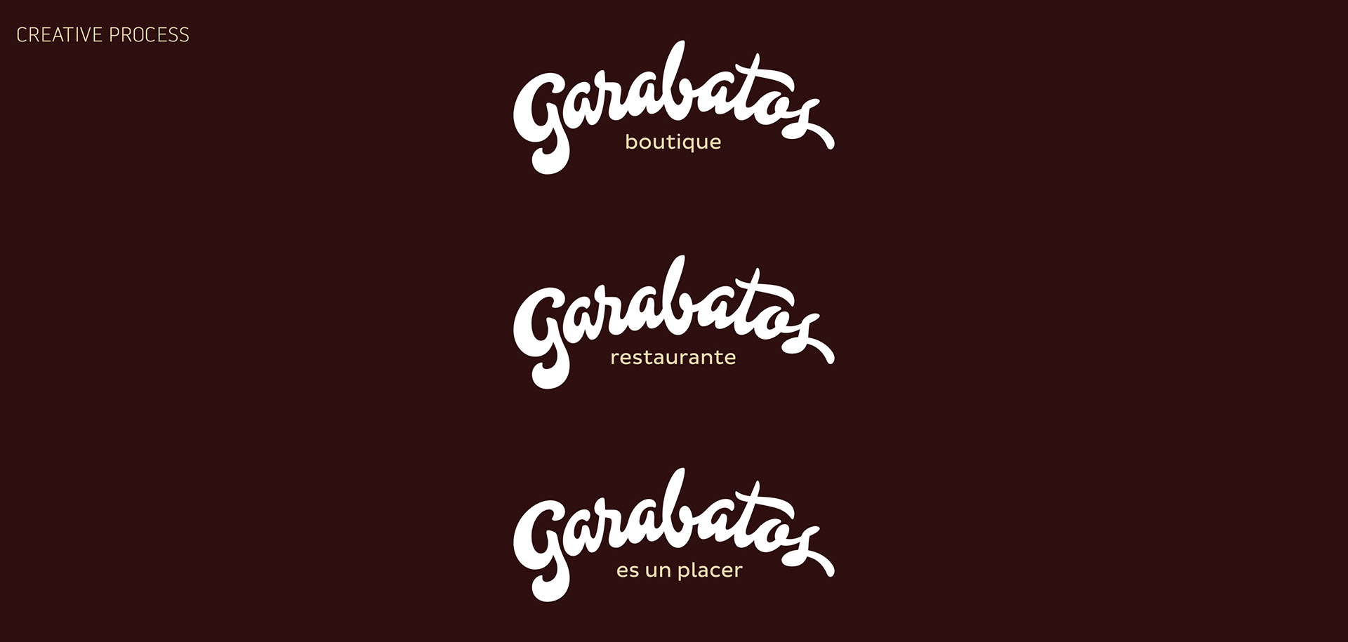
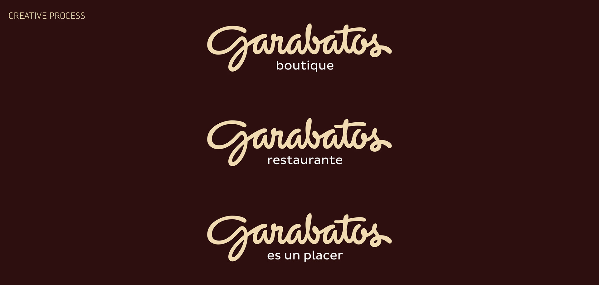
We tried to maintain the structure, weight, and size of the existing logo and fixed the terminals of each of the letters and balanced the internal white space and tracking of the word mark. You can see some of our explorations and creative process below.
The new redesigned logo has a more uniform weight, better balance, and overall better design, making it easier to read and aesthetically more appealing while solving the first necessities for its usage in tight horizontal spaces.
Art Direction & Branding: Jorge B. Garrido.
Design by: Jorge B. Garrido
Lettering by: Quique Ollervides.